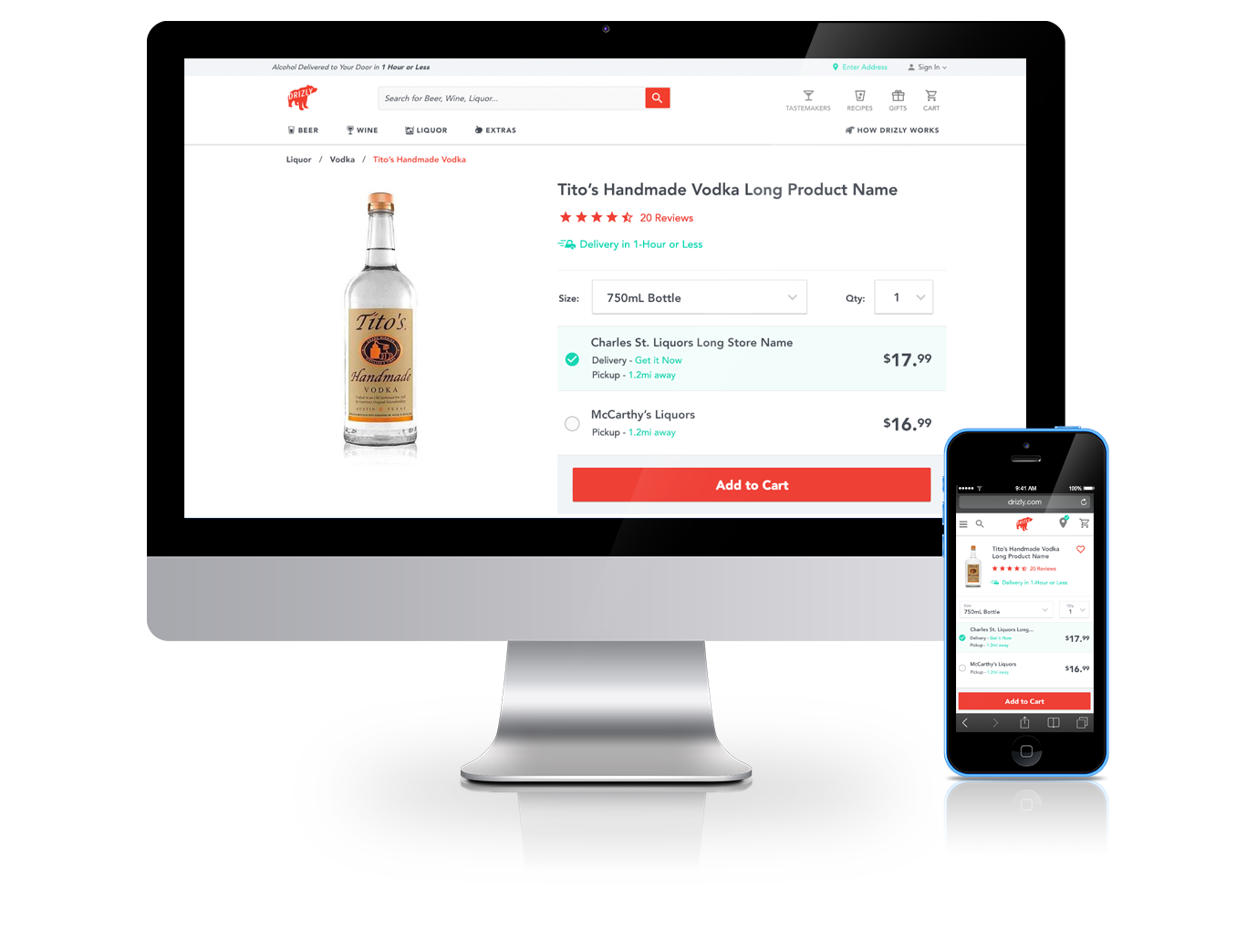
Drizly Product Detail Page
- aside
- Category: UX & UI Design
- Permalink

Project Samples
The Challenge
Drizly offers a unique service to customers through a multiple-store shopping experience. The challenge with offering products from multiple stores is surfacing multiple prices, purchase options, and stores. Additionally, these elements must allow the user to make an informed decision.
My Role
Conceptualize and design the multi-store experience for product detail pages. This is accomplished through research, sketching, wireframing, and visual design.
The Approach
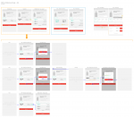
The first stage of the project required research of quantitative metrics, along with qualitative user testing. I conducted several user tests in the form of card sorting interviews. Through this research, I learned what purchasing decisions drive users to complete a purchase. This combined with metrics from the pre-existing PDP provided a clear approach on what elements should be visually prioritized. With this data, I moved through wireframing into design. This project has evolved and continued to grow, and I have continued to research and conceptualize advanced page layouts to increase conversion.


