Citizens Access
- quote
- Category: UX & UI Design
- Permalink
Project Samples
-

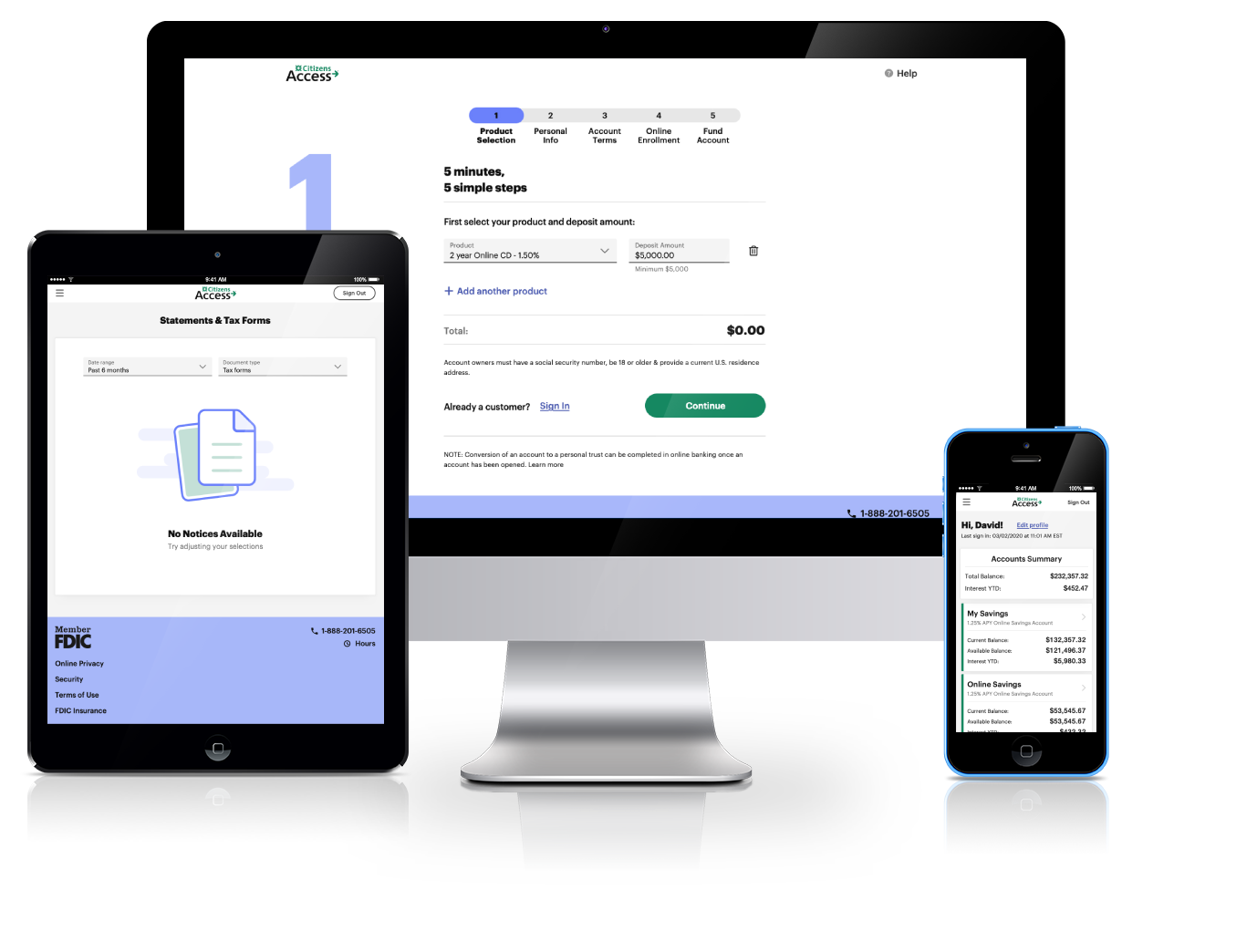
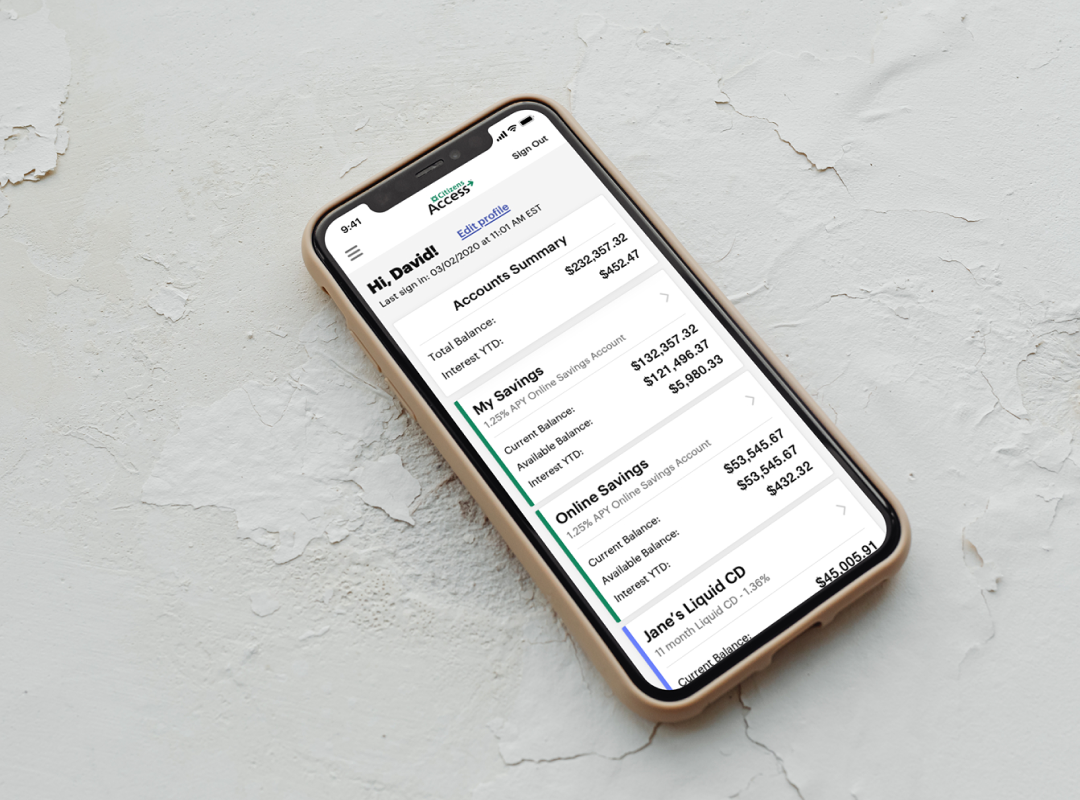
- Account Summary – Mobile
-
- Account Setup – Desktop

-
- Online Account Opening – Mobile

-
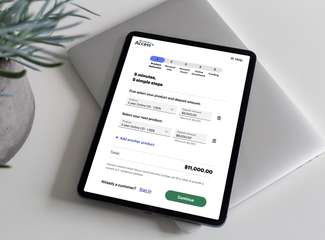
- Online Account Opening – Tablet
-
- Digital Palette Stacks

-
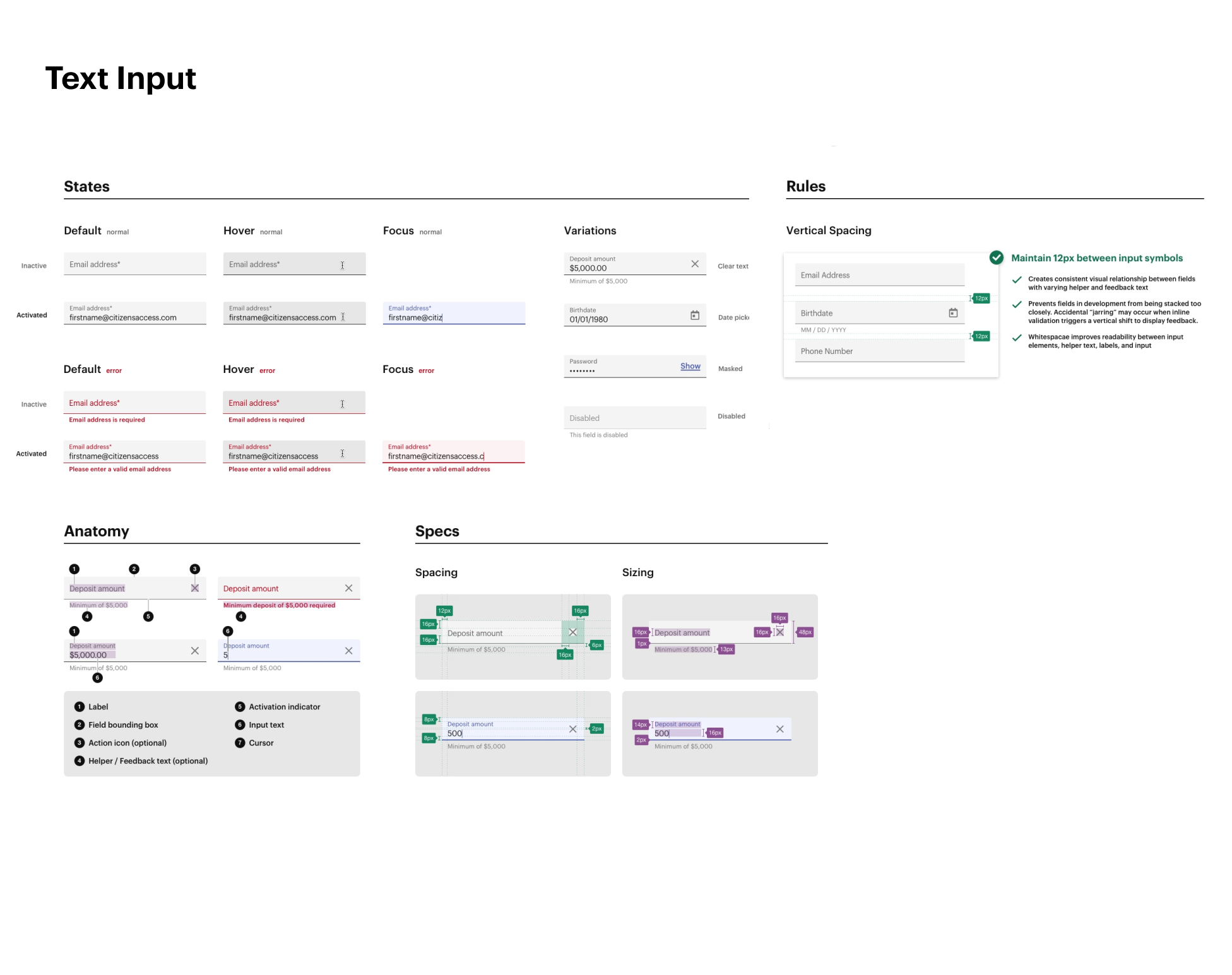
- Input Field Specs
-
- Buttons & Interaction States

The Challenge
Citizens Access (CAX) is a digital-only wing of Citizens Financial Group (CFG). Launching in 2017, the CAX model was a pilot for CFG’s a national banking strategy. In under 2 years, CAX accounts totals were valued over $1b and growing. With digital-only banking becoming a rapidly growing model, CFG invested in a robust platform transformation for CAX in 2019. This project would be called the Modern Banking Platform. CAX was shifting onto shifting into a modern authentication / security framework with dynamic core banking features. This would support a growth strategy for CFG to support more dynamic product offerings and seamless integration into native mobile applications.
My Role
In late 2019 CAX partnered with Green Pixel Studios, and I was brought on board to manage a “like for like” design translation onto the new core platform. With an ambitious go-live date on the horizon, I learned quickly that the existing experience suffered from numerous usability and accessibility issues. The original scope of my engagement required reconsideration, and I successfully pitched a re-scope of my role to focus on a wider design execution strategy. Receiving additional funding to grow a supporting UX team, I hired a team of 3 researchers and 2 additional designers.
Our challenge was to deliver an engaging experience that supported growth, retention, and reduced customer service engagement. The catch was that we had to maintain the CAX “look & feel” to avoid customer change-aversion, or heavy development overhead. My success would be redefined by establishing a UX strategy focused on efficient delivery of an improved, not new, customer experience. While managing a UX support roadmap that aligned several development pods.
The Approach
I intentionally try to assess an existing experience as early as possible, allowing me to form an objective unbiased lay of the land. We kicked off our work by performing a baseline heuristic analysis, an approach was based on Nielsen’s interface design heuristic guidelines. This would allow us to identify areas of high-risk to the experience, yielding a design strategy that supports the business’ rapid delivery objectives, while mitigating downstream risk. Additionally, I wanted to pinpoint key journeys to test with users later on as we dug into the authenticated experience. The CAX UX team consisted of myself and 1 researcher at the time, so we decided to only focus on Storefront and Online Account Opening.
The sliding scale of design quality vs. delivery efficiency is tends to be a hot topic. During this engagement, we had the opportunity to lead workshops to educate our stakeholders on the value of UX and design quality. Through these workshops, we established a set of cohesive design principles to support both efficiency and quality, providing ownership and autonomy to the design team. Principles that supported our design mission of “Evolve, don’t change”.
With principles in place, the last major efficiency driver would be to establish design standards and create a design system. Since we did not have any legacy design specs to work from, I spent the next 8 weeks designing the Citizens Access Design System from foundations through patterns into templates. During this time I hired 2 additional designers to support these efforts, and operate at a pod-level with our developers.
Our design phase lasted 10 months and supported development that continued for another 8.
.